Phew, everything is now officially over, i have moved back home but not quite unpacked and found new homes for my belongings...with this i will promise to keep more up to date and blog more! :)
Here are my final degree show pieces, exhibited in Bonnington Gallery, Nottingham Trent University.
Thursday, 23 June 2011
Friday, 10 June 2011
Finished!!!
So I've not posted for a while because I've had sooooo much to do, hand-ins, degree show, private view and industry views... not that thats all over ( cant quite believe it actually is) i can share my collection of final designs.
The following three collections of designs for interiors...
and these are wallpapers...
The following three collections of designs for interiors...
and these are wallpapers...
Wednesday, 11 May 2011
Monday, 18 April 2011
Half Drop...
To get my ideas flowing about my Interiors collection i did some research, the most versatile designs are really quite simple at first glance, based around a simple stripe or polka dot maybe...
I began by selecting my imagery and trying out simple repeats, the half drop worked really well with the floral image.... layered up on top of a coloured stripe background the simple layout looks quite sophisticated and classic.
Wallpaper...
Here is one example of one of my wallpaper designs...The layers of traditional 'Damask" style motifs, combined with the complementing colourway creates quite a contemporary feel.
I am hoping to finalise this collection by the end of the week, ready to move on to Interior/Upholstery fabric designs...
Wednesday, 13 April 2011
Tuesday, 12 April 2011
Collection 3...
To help kickstart the third and final term (eeeeek!) i decided to try and organise my designs into 3 separate collection and have a count up of how many designs could possibly be final samples....
The first collection is based more of surface pattern with a mix of compositional pieces and repeats...for notebooks, gift wrap and stationary maybe?
The second is based a lot more on texture and is more subtle...these lend themselves to more interior design and wallpaper.
The third will hopefully include more of my visual research, so more image based. ..i am as yet unsure of the final application of these designs but again will probably be more suited to products due to the composition....
Friday, 25 March 2011
Tuesday, 22 March 2011
Room for Improvement...?
Although i had previously said i wanted to create a more vibrant collection for my fabric experiments i feel i needed to tone down the colour to allow them to compliment my existing designs, i have create the above effect by "Cellulosing" the original print outs and scanning them back in...
Wednesday, 16 March 2011
New Collection?...
The next step of my development process is to start experimenting with fabric printing...in the past I've found the digital printer, combined with the fabric, sometimes makes the colour of the image a lot lighter therefore i wanted to create a few samples with a bit more vibrancy and zing.
The above designs started of photographs from a china cup, however with some mirroring effects and blending tools i have created some quite statement compositions.
Friday, 11 March 2011
Paperweights...
To try and put my designs in Market context i have been experimenting with different papers, seeing if the weight and texture changes the image or makes it look a certain way...
I really like the tracing paper prints and think these would look good on sheer fabrics!...
Wednesday, 9 March 2011
Dear photoshop...
I created this simple design on photoshop using the postcard template and layering imagery using the stamp tool, experimenting with the opacity creates the delicate, vintage feel.
Tuesday, 8 March 2011
Monday, 7 March 2011
Lene Toni Kjeld
Transitionwallpaper: so called hybrids, a combination of 2 different repeat patterns...
http://www.walldecoration.dk/concept.html
Sunday, 6 March 2011
Collections...
After my tutorial on thursday i feel a bit more clear on my collections. The more floral collection was well received and 6/8 designs were selected for a possible collection.
My next project alongside building up more designs to create further collections is to experiment with papers and fabrics...
By printing my designs onto a range of materials i will have a better idea about what the designs can be used for. This week i am going to send some designs to the digital printer and print some onto wallpaper.
Wednesday, 2 March 2011
Claire Scully...
I really like the ghostly, ephemeral feeling to this image. The monochromatic colour scheme enhances the imagery and allows the layering to show through.
Monday, 28 February 2011
After the Weekend...
So its Monday again, these weeks go so fast!
Over the last week i've been thinking of ways to combine my imagery, making it work together in a number of ways without it becoming repetitive. I have come up with a possible solution of created mini collection, or sub-themes.
I've began to play around with some of my imagery, creating patterns and brushes in Photoshop, exploring which types of imagery work better together and with certain colour ways.
Below are two designs created today...
Tuesday, 22 February 2011
Teach yourself Kaleidoscopes!
As well as using the tool previously posted to create Kaleidoscope patterns you can also create them on Photoshop...
Today i came across a tutorial teaching you how to do them...http://www.photoshopessentials.com/photo-effects/flip-mirror
Basically the image is repeated in all 4 corners of the square alongside a horizontal and a rotated copy on the top. Blending modes can then be adapted to personal taste/outcome.
The original image i used was very transparent and ethereal, creating a very ghost-like design. However bolder design show the layering and depth more clearly.
Colour Palette...
I want my colour palette to capture the aged antique concept of "The Curiosity Shop", i quite liked the idea of almost 'tobacco stained' colourings combined with fresh colours, inspired by the more floral designs found on the china teacups and plates.
This is a working colour palette that may need to be adapted when printing onto fabric, however it will allow me to work more coherently in Photoshop and allow my designs to work together as a collection of work.
Friday, 18 February 2011
An age old technique...
For the past year i have been struggling to achieve a vintage feel to my photography...previously the best technique i had found was emulsion transfer, painting onto the back of photocopies to transfer the ink...this process is quite temperamental and leaves a textured surface which is not always desired.
BUT finally i have come across a technique that transfer the photograph/image easily, without any residue....Cellulose Thinners!
I painted the solvent based liquid onto the back of the photograph above which then transferred onto the previously collaged graph paper.
I love the overall effect and will be sure to experiment with it further!
Thursday, 17 February 2011
The Butterfly Effect...
This piece by Damien Hirst has really inspired me. I love the overall Kaleidoscope effect but what really interest me is when you look more closely and realise the colours are made up of Butterflies.
The concept of things not being has they may seem is something i want to explore further...it would be a great idea the degree show, to make people take a second look...
Kaleidoscope Fun...
Today i decided to try and teach myself how to create a "Kaleidoscope effect" in Photoshop by using a tutorial available on the web.
Whilst searching for an appropriate page i came across a website allowing you to upload an image which they then turn into a Kaleidoscope design.
The images above of the piano is the original image i used, then, (with a little help from http://www.tuxpi.com/photo-effects/kaleidoscope) and a few tweaks i have the above designs!
I am looking forward to scanning in more of m imagery and seeing what else i can create...
Tuesday, 15 February 2011
The Fabulous Fifties...
Over the last week i have began to look more at geometric shapes, experimenting with spirographs and stencil shapes...this lead my contextual research down the route of designers such as Lucienne Day.
I really like the simplistic designs of the 50's patterns and the range of colour ways. Sandersons have a range of exciting, 50's inspired wallpaper and fabric. each design is bursting with colour and really make an impact in the home.
These type of designs are something i have felt really inspired by and would like to incorporate in my work. i think my imagery would work well with this concept, combining quite static imagery with more ornate, antiques pieces to give a personal twist and a fresh take on the iconic designs.
http://www.sanderson-uk.com/50s-wallpaper.aspx
My Inspiration Wall...
Today i was asked if i use the studio space available to third years at the university... i was honest and said no, i never have.
People work in all different ways, some may work better in a group, bouncing ideas of each other, some may prefer working in the studio as they are nearer to facilities such as computers and printers.... however i don't feel i work well like this.
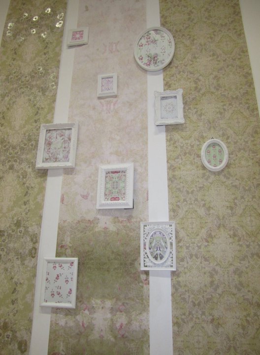
For the past three years of being at uni i have worked from home, reasons being, all my equipment and media is here, it would be a struggle to have to cart it in everyday, i also prefer to work in quieter conditions, maybe with a bit of music on in the background and but mainly because i find myself a lot more inspired as i can create moodboards/inspirational imagery collages on my walls.
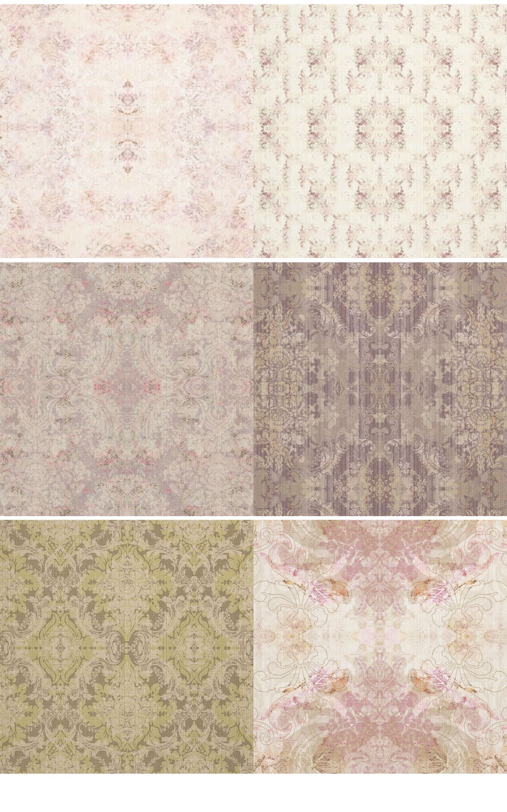
This is my wall...it is a collage of all the ideas i am working on within this project. It allows me to combine imagery quickly on a large scale and visualise shapes together. It my look a mass of paper and sticky notes but it allows me to see how the imagery is working overall as a collection.
Friday, 11 February 2011
Kirath Ghundoo
Kirath Ghundoo designs are very geometric and eye catching. i love the combination of media, including felt tip and pencil crayons.
The intricacy of the geometric shapes os something i want to achieve, however i want to combine my imagery with more delicate objects such as the antique china and quirky animals to create a personal approach.
http://kirathghundoo.com/
Inspiration...
As i mentioned in a previous post i have began to look at circular shapes and patterns within them, china plates have given me a lot of inspiration....
whilst being at home i have been collecting photographs of different china and glassware and have been specifically inspired by them shapes within them...cut glass in particular is actually quite geometric and would tie in well with my spirograph designs.
Subscribe to:
Posts (Atom)